
- About
- All Categories
- Areca Palm
- Blog
- Bulk Orders
- Cart
- Chat with us
- Checkout
- Collections
- Cotton for a cause
- Covid-19 Update
- Customised Curtains
- Customize
- explore
- Export Customer file for Facebook
- Feedback
- Furnish Your Dream
- Furniture
- Get in touch
- Gift Cards
- Home
- Home old
- Home1
- International Orders
- Kitchen and Table Best Sellers
- My Account
- My Gift Card
- New Arrivals
- Payment Policy
- Privacy Policy
- Returns and Cancellation Policy
- Sale
- Sale Category
- Sale Today
- Shipping Policy
- Shop
- Shop the Look
- Subscribe
- Support
- Terms & Conditions
- test page
- Thank you
- Thank you
- Thank you
- Track Order
- Verification
- Weaver’s Diary
- Wishlist
International Shipping Available | Free Shipping on orders above ₹999/- | Newbies: Use code WELCOME200 for ₹200 off on orders above ₹2999* | Prepay and Save: Enjoy an Additional Discount**
Fixing the Patterns vs Colour Block dilemma
One usually misses out among the many things while dressing up a house or space. An important factor among these is to find a fulfilling union between colours, textures, and patterns. Home decor is a sneaky yet relatively simple game. A little splash here, flowy texture there, and you can end up with a personalized […]
One usually misses out among the many things while dressing up a house or space. An important factor among these is to find a fulfilling union between colours, textures, and patterns. Home decor is a sneaky yet relatively simple game. A little splash here, flowy texture there, and you can end up with a personalized look that elevates your bare walls and dull furniture.
The secret here is to figure out if you have a soft spot for colour blocks or patterns. Add that to the marvel of the colour-wheel and designs. Stir it up, and you may have just begun brewing a beautiful look.
We will help you navigate these little, yet essential decisions in your theme sooner than you can say “visual balance.” Let’s step in
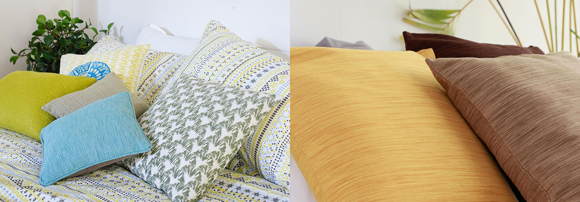
Incorporating patterns
If used smartly, patterns can be fun, innovative additions that uplift the vibe of your home. If you have empty, vacant spots around the house, patterns can make startling changes to make it look intimate and friendly.
While incorporating patterns, you need to be looking for ways to make layers. Layer your patterns using different styles and scales. A patterned couch or bed-sheet can do good with another layer of patterns in their cushions or rugs.
Suppose you have neutral no-nonsense furniture, geometric patterns like Aztec designs, stripes, and checks and easily invite colours and depth to the room. Prints often look their best on curtains, pillows, cushions, and throws.
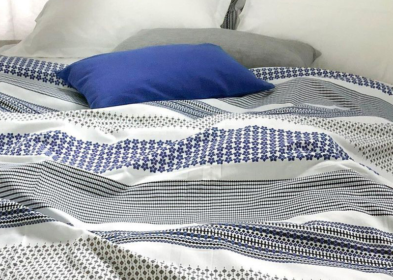
Pair your large patterns with similar but smaller patterns. Follow the larger scheme and include a compact, tinier, or lighter version of the same. Thick stripes on table runners do well with muted stripes in complementary colours in the form of table mats or pot-holders.
Got a textured/patterned wall? Try matching its primary shade with the curtains, bedspreads, or covers. This makes it look very organized, contemporary, and sleek.
Lastly, don’t let rules hold you back. If you feel like rainbows and brushstrokes, then combine them by all means!
Incorporating colour blocks
colourblocks do everything to your home that drab, off-white home decor refuses to. It fits well with any theme you choose to welcome. They are generous with small spaces and contribute to making it look more spacious too.
Monochrome colours are a brave choice. Here, you pick a primary hue and match your home accessories with the closest shades and tints you find. A beige couch can help caramel brown curtains to come alive. Similarly, dull grey tiles in the washroom can be spruced up with black bath towels.
If you want a colour to shout attention, arrange your decor scheme in monochrome and add a loud splash of bright colour from either a cold or warm palette. The surprise element lies in its ability to stand out from the contextual crowd. Think: yellow in a room of browns, green in a place of whites and greys…and so on.
Trust the colour wheel. Visual balance, through the viewpoint of design, is indeed achieved when colours reach a harmonious equilibrium. Analogous colours help the best when trying to identify a suitable palette for the room.
Pick a theme (warm/cool/earthy/glam) and select one primary, eye-catching colour from the category. Look around for analogous colours that lie adjacent and pick what feels right. Trust your gut.
While popular palettes are all over the internet, it can seem intimidating. Our recommendation? Use mood boards for inspiration if you’d like but always pick the product that speaks to you best. If you feel your pinks go better with the blue than the peaches, then we say you are spot on! Don’t forget to have fun with your space.